How Pinterest’s design systems team measures adoption
I’m a design technologist, and most of my background is in engineering and product management. If you’re familiar with these two spaces, you may know the emphasis they place on measuring impact. From code velocity, to active users and engagement counts, there’s a number for everything. That number—whatever it is—is important because it provides us with a shared language and consistent indicator of what it means to move in the right direction.
Identifying good metrics for Pinterest’s design system, Gestalt, is no different. It’s hugely important for our team to know how much value we’re providing, and for our leadership to understand whether the investment is paying off.

Over the past year at Pinterest, I’ve been working on a new metric for Gestalt called design adoption. As a design systems team, we wanted to maximize the usage of Gestalt and increase component adoption—starting with our designers. To do that, we needed to measure how the system was being used across the board in Figma.
But why measure adoption in Figma?
Even before I set out to establish the design adoption metric, we had a code adoption metric. In fact, measuring system component adoption in code is a common way for design systems teams to see how their system is being used. Through code, we can see which components are being used, where, and how. For example, we can tell whether teams are using the full component, or if they’re making changes—which is an indicator that we need to revisit a design. Our team ships web components that designers and developers across Pinterest use to build our product. Usually, we keep an eye on whether the components we end up building are, in fact, making it to the product. With code, we know that no matter the team, everything they ship is going to live in the codebase, so it’s a concrete place to measure component adoption.
However, our code adoption metric had two caveats:
1. Code adoption only works on web The Gestalt engineering team only ships web components, while Gestalt as a whole ships design components across iOS, Android, and web. So, our adoption metric was limited by the platform we ship code to.
2. Code adoption takes time Sometimes, for brand-new components or surfaces, it takes time to reach widespread adoption. Designers may also not have a chance to use the components in their designs yet, so there’s a lag before we see any movement in the metric.
Defining design adoption
It’s not that code adoption as a metric isn’t good, it’s that code adoption doesn’t tell the whole story. If we want to convince our organization to invest in building code components for iOS and Android, how do we know that people will use them? Hypothetically, if we could show that designers were using our components in Figma, it would be very easy to prove that we should build components for all our platforms.

Design system adoption really begins in the design phase. If designers don’t know that components exist, we shouldn’t expect our engineers to know either. For our designers, the design phase happens in Figma. Prior to establishing our design adoption metric, we didn’t have many insights into what was happening inside of our Figma files. As a team, we were super curious about what insights we could uncover, and what our baseline design adoption was.
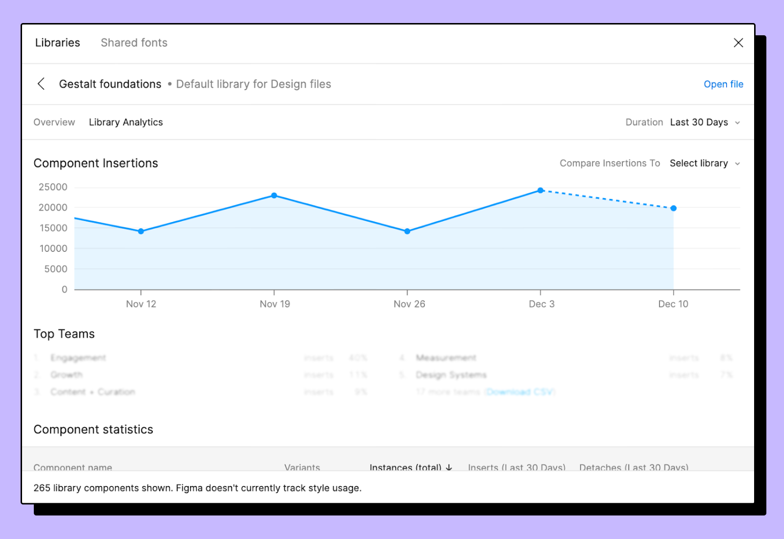
Out of the box, Figma provides analytics that break down the number of component instances and insertions by team.

These numbers are a great start, but not quite the adoption metric we were looking for. The problem with instances and insertions is that they are really just counts. It’s great to know that we had 27,056 insertions and 245,123 instances of our button being used—but is that a good thing? It’s hard to say what constitutes a “healthy” count.
Let’s say there’s a large design file with over 1,000 nodes, and of those, 10 of them come from our Gestalt libraries. That means that only 1% of the design was made with Gestalt. Yay, we have component usage—but sadly not a significant chunk of the entire design. So, the adoption measure we’re looking for is relative to everything else that’s on the page.

In the picture above, the layers highlighted in red are nodes that originate from the Gestalt Figma library. On the entire page, there are 15 layers total, and seven of those are from Gestalt. We calculate this score individually across all the frames on a page to get us to a total design adoption score.
So, in this case: 7 Gestalt layers ÷ 15 total layers, or 46.6%.
Measuring adoption at scale
At Pinterest, we have eight different design teams working on shipping surfaces across Android, iOS, and web platforms. Every week, designers interact with hundreds of files. To calculate adoption across the board, our initial plan was to ship a Figma plugin that measured the amount of Gestalt components being used. However, that would require solving two problems: design system adoption, and also plugin adoption.
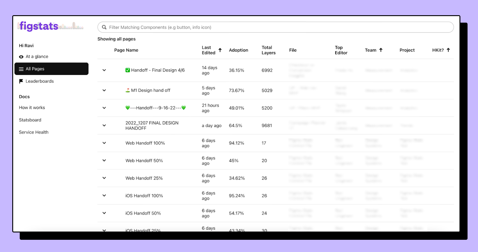
Fortunately, Figma exposes a REST API for us to leverage. It enables us to build a tool that calculates design adoption in the background, without slowing down our designers. I set up a service which I called FigStats, and it runs every night and looks at all of our Figma files. It tallies up the totals to calculate an adoption percent across the entire organization.

FigStats allows us to drill down into our adoption metrics from an organization level to an individual Figma file. We not only see adoption scores, but also the composition of files, and how they influence the bigger picture.

As an added bonus, we also run a measure to see how designs are utilizing our text and color styles. If designers aren’t using one-off hex codes, or off-brand fonts, that’s a win for our design system.
Metric pitfalls
We don’t think our measure for design adoption is perfect. Unlike code, designs live everywhere and are always changing.
This means that Figma files are super noisy. There are a lot of hidden layers, unused nodes, and text scattered everywhere. In the last year, there were 1,853 Figma files that designers worked on across all of Pinterest. So when coming up with this metric we couldn’t just run it on every single file that exists. It’s also incredibly easy to toss files and create new ones. Even if everyone started using the design system tomorrow, moving the adoption measure would be hard because there are a lot of old files.
So for our design adoption metric, we set a couple of boundaries to limit our scope:
We only look at files edited in the last two weeks. This way, we have a rolling measure of how new designs are handling adoption.
We only look at pages marked as “handoff.” Figma files often have various scratchpads and explorations. Typically, only handoff pages make it into the product.

We specifically look at handoff pages because we know that designers take time to tidy up these pages before handing them off. Conveniently, most designs in the company are also labeled with a “handoff” in their name. These pages are typically seen by developers and multiple stakeholders before they get built. For an adoption metric, they seemed like good candidates.
Where are we going?
About a year ago, we didn’t really have much insight into activity in Figma files. Aside from our survey feedback, we didn’t know a whole lot about the relative usage of our components and the areas they were being used in product.
Today we have a stronger sense, quantitatively, of what’s actually going into these designs and where designs are happening.

We’re still experimenting with how we can integrate our findings into our larger design operations story. But as a start, there are a few things we’re looking at to utilize our newly-found design metrics:
Adoption: Knowing where and how components are used in our designs helps us see trends about where our system is easy or difficult to use. We can also pinpoint teams that struggle with incorporating the system.
Quality: As part of our analytics, we run a cloud linting process to understand if design files meet certain file hygiene standards. For example, of all the text nodes on a page, are they using our text styles? We also wanted to figure out the number of hex codes versus fill styles. Figma doesn’t allow us to edit these files from the cloud (🤞), so we began working on a plugin that our designers could run locally to improve overall file cleanliness.
New components: Sometimes designers will create local components and paste them across different designs. Now that we have a way to identify that, we can see if these customized, local file components are being distributed widely across a team. If we notice enough usage, it’s an opportunity for us as a system's team to consider adding it to our larger design library.
We think that design adoption is a complement to the components we ship in code. For example, we noticed that our PageHeader adoption was low. We eventually learned that it was due to a limitation in our code component. However, the design adoption told us a different story—that teams were actually trying to use our components. So that’s an example of where design and code adoption can give insight into the health of our system.
We’re just scratching the surface of design system analytics, and design adoption is our first foot forward in the space.
Try it yourself
We’ve done some work to open source the way we calculate design adoption, so you can take it for a spin and measure your adoption scores too. When looking at the numbers, it’s hard to say that there’s an ideal number for adoption. It comes down to how robust your system is, and how people are making use of it. If you’re not sure where to start, use our library to get a baseline.
Give the REPL a try here with your Figma API Token and the IDs for your design teams. It may take a while to process all of the files and calculate an adoption score, so you might want to grab a coffee.

You might notice that adoption on certain teams is 50%, but only 2% on others. Those might be files worth drilling into and discovering what teams are doing differently from each other.
We’re super excited about what it means to have a metric that takes designs into consideration. If you have any questions, or are interested in jamming on ideas, send us a hello at gestalt(at)pinterest.com.